About Me

Hi I'm Linh Nguyen. I have hands-on experience in brand marketing, product marketing, communication and project management across various industries, from hospitality to retail.

I strive everyday to be a skilled and compassionate communicator. On cultivating an eager-to-learn attitude, I acquire knowledge and skills across interconnected fields—including but not limited to marketing, communication, user experience, accessibility, and sustainability—which provides valuable insights and makes my work well-rounded, thoughtful, and inclusive.

Education

Education

University of Leeds

Leeds, United Kingdom

  • Relevant Coursework: Digital Practices, Critical Study in Visual Communication, Contemporary Debates in Media and Communication

2024-2025

Simon Fraser University

Burnaby, BC, Canada

  • Major in Communication, Minor in Print and Digital Publishing
  • Relevant Coursework: Communication for Social Change (grade: A), Applied Communication for Social Issues (grade: A), The Political Economy of Communication (grade: A), Qualitative Communication Research (grade: A), Empirical Research Methods (grade: A-), Women and New Information Technology (grade: A-), Communication, Science and Technology (grade: A-), Introduction to Information Technology: The New Media (grade: B+)
  • 2023-2024 Dean's Honour Rolls
  • Leadership & Activities: FCAT Dean's Student Advisory Council

2020-2024

Experience

Work Experience

FCAT Dean's Student Advisory Council Member @Simon Fraser University 02/2023-05/2024

  • Played a crucial role in representing the student body's perspectives, concerns, and needs to the FCAT Dean and other faculty members, fostering open communication and transparency.
  • Contributed to the organization and execution of events and initiatives aimed at enhancing the sense of community within FCAT, such as student forums, networking opportunities, and workshops.
  • Worked as part of a diverse team to formulate recommendations and action plans for enhancing the overall student experience, including academic support, extracurricular activities, and resources.

Sales & Marketing Administration Intern @BOSCH 11/2022-05/2023

  • Collaborated closely with the Measuring Tools manager to gather market insights and essential data, supporting informed decision-making.
  • Coordinated quarterly marketing initiatives for the Measuring Tools and Power Tools divisions, utilizing data-driven strategies
  • Conceptualized, crafted, and released engaging promotional and informative content across Bosch's Facebook, Instagram, and staff email platform Contributed to in-house POSM design such as leaflets, posters, and promotional goods.
  • CManaged Bosch's internal sales channels, overseeing stock levels, payment processing, and promotional activities with a focus on data-driven optimization.

Brand & Marketing Intern @The Ascott Limited 03/2022-09/2022

  • Ideated, wrote and published both promotional and viral content on Facebook and Instagram, boosted fanpage's visits and interactions by up to 500% per post.
  • Coordinated quarterly marketing initiatives for the Measuring Tools and Power Tools divisions, utilizing data-driven strategies
  • Planned and wrote press releases and sent over to notable newspaper and broadcast stations for publishing (HanoiTV, Vietnam News....)
  • Crafted automatic emails and mass sent to 7,000 guest emails every month
  • Developed and executed celebratory and partnership events, including travel fairs, festas, MOU signing event...

Social Media & Communication Coordinator @Simon Fraser Public Interest Research Group (SFPIRG) 02/2021-09/2021

  • Planned and executed weekly social media projects, boosting interactions by up to 500% and gaining around 50 monthly followers.
  • Organized bi-weekly workshops on social issues and civil rights, engaging over 500 members and followers.
  • Collaborated with various stakeholders to create compelling and informative multimedia content, including graphics, videos, and articles, to support our advocacy and outreach efforts.

Weekly Reflections

Reflections

November 27, 2024

Week 8: Categorisation and Algorithmic Identity

In this week’s workshop, I worked with Facebook Ads and Google Ads to see how these platforms “categorise” me as a user and consumer by examining the advertisement preferences that they assigned to my account. In general, there were not that many differences about how the platforms were seeing me.

While Google categorised me under both professional and leisure themes like jobs, business, productivity, and education, as well as skincare, and fashion advertisements for my account (see IMG 8.1), Facebook’s Ad Preferences section leaned heavily towards lifestyle-related categories (see IMG 8.2).

IMG 8.1
IMG 8.2

Interestingly, these categorisations did not fully make sense to me. I spend a significant amount of time engaging with cultural posts, memes, and content related to art and community, yet these interactions seem to be ignored in favor of commercial aspects. For instance, my Facebook feed usually has post suggestions like cultural and academic memes, literature, and opinions. However, the way my Ad Preferences section only focuses on lifestyle categories is overlooking the cultural and creative dimensions of my activity and reduces my interests to what can be monetised through targeted ads. This reveals how platforms prioritise certain data points, those that align with their commercial goals, while sidelining aspects of my identity that do not directly contribute to advertising revenue.

I would say it is hard to change the output since I have actually been interacting differently with the platform, such as engaging more selectively with content that reflects my cultural and creative interests, in hopes of reshaping the data these algorithms process. Yet, nothing really changes with the way the content promoted on my Facebook newsfeed is mostly about clothes, accessories or skincare. Generally, I do not trust social platforms in terms of actually reducing advertisements and promoted content.

The second task that I found interesting while doing was the Sumpter method. For this task, I had to look at the most recent 15 posts from 32 of my Facebook friends and categorise them into 14 categories (see IMG 8.3).

IMG 8.2

I was fortunate that most of my Vietnamese friends and family are still active on Facebook, so looking at the most recent 15 posts of all of them was not difficult. However, the challenge arose when it came to categorising these posts. The issue is not just the number of categories available, but the nature of the content itself. No matter how many more categories I created in my mind, there would always appear posts that did not quite fit into any one box, or those that could easily fit into multiple categories at the same time. For example, a post that mixes a personal anecdote with political satirical commentary and humor might not easily be categorised as just “Jokes/Memes”.

If I were to iterate on this process, I would likely change or refine the existing categories. The current labels are too broad, and they do not capture the full range of complexity and nuance within the posts. For instance, adding more categories, such as “selfie” “study” or “personal achievements” could help, but even then, the lines would still blur. If the categories were too rigid, they would miss the context of the posts.

Additionally, during the task, I changed the way I interpret posts to include more context. Instead of simply categorising based on surface-level traits, I asked more questions about the post’s intent, its tone, or the larger cultural or emotional context behind it. This allowed me to better capture the essence of each post, but I also had concerns about my own biases and subjectivity.

This process, and the choices I have made, reveal that categorisation is not a straightforward or objective task. The outcome of this iteration suggests that even with well-defined categories, context is essential to accurately capture the meaning behind each post. This is important because it shows that data analysis, particularly in social media and its algorithms, cannot always be reduced to simple categories. There is a complex interplay between the content, context, and intent of posts that algorithms and manual categorisation often fail to capture fully.

November 17, 2024

Week 7: Machine Learning

This week, I had a chance to work on machine learning, a topic that both fascinates and intimidates me at the same time as a non-STEM student. Why the fascination? From my very personal view, machine learning has been a buzzword to describe the “magic” of Artificial Intelligence, a concept I have been curious about for some time. My interest grew even bigger after reading Dr. Stephanie Dick’s (2019) work on the history of artificial intelligence. I am particularly impressed by the idea that aspects of human intelligence can be broken down and described so precisely and detailed that machines can mimic and “learn” them. However, I am also intimidated by it because it is a vague, complicated, technical, science-y field that I feel like I can never truly understand, or go to the core mechanics of it. This workshop gave me a chance to engage with machine learning hands-on. And, ironically, both spectrums of my feelings towards machine learning are reinforced after this.

We worked with Teachable Machine, a user-friendly and interactive tool for exploring machine learning. The tool offers three main functions: image, pose, and audio. I mainly worked on the image and pose functions as testing the audio function in class felt inconvenient (and I was not entirely comfortable speaking out loud). The image recognition function was both fun and engaging. I collaborated with Chesca and we took turns to appear in front of the camera to see if the machine could differentiate between us. Initially, the machine performed well. It identified each of us with 100% accuracy. However, problems arose when my face was out of frame and only parts of my body, such as my shoulder, visible while Chesca was on screen. The machine still identified me as being fully present (more than 90% me while only 10-20% Chesca), as though my face were still visible.

Later, I individually explored the pose recognition function. This tool detects pose and movement along a horizontal axis and responds to gestures (like heart signs), tilts, and other motions. I experimented with 5 different poses: no pose, tilted head, heart sign, V sign, and half heart sign. The tool did well only when I performed each pose precisely as in previously captured “model” photos. Disappointingly, when I zoomed out farther or zoomed in nearer than the model photos, it started to mess up and identify as another pose (see IMG 7.1). Also, it did a bad job in identifying my hand gestures. For example, when I did the V sign, it incorrectly identified as the finger heart sign (see IMG 7.2).

IMG 7.1
IMG 7.2

These experiments helped me realise the strengths and weaknesses of machine learning. I appreciated how accessible and engaging the tool was; and exploring what the machine could do blew my mind a little bit. Yet, its struggles with context and variability really stood out to me. It showed how crucial precision is when training these models. Again, the recurring questions of machine learning and artificial intelligence in general arise. Can these machines truly handle nuances? How much detail needs to be fed into the system to improve its accuracy?

Reference:

Dick, S. (2019). Artificial intelligence. Harvard Data Science Review. https://doi.org/10.1162/99608f92.92fe150c

November 14, 2024

Week 6: Data Visualisation

(I am still working on this week's reflection. Please come back later. Thank you!)

November 7, 2024

Week 5: Some reflection on Kennedy & Hill's study on data visualisation

I believe data visualisation is not just a technical skill or a simple way of presenting information; it is a powerful process that shapes how we perceive and understand the world. As discussed in the reading, the ideological work of data visualisation is significant because it is not as neutral as it often seems (Kennedy & Hill, 2017). Data visualisation can be shaped by the subjective choices of the people creating them. These choices, such as what data to use, how to display it, and which aspects to highlight, have a great impact on how the information is interpreted. By presenting data visually, not only reality is presented; it is knowledge that is actively constructed in ways that reflect certain values and power dynamics. This is why visualisations carry so much weight, they can influence public opinion and shape societal understanding of complex issues, even when the full context of how the data is presented is obscured.

The reading also brought up how data visualisation can represent knowledge, and I think this is an important point. The design aspect of data presentation influences what and how we understand it. When creating a visualisation, decisions about scale, colour, and which data points to emphasise or obscure, are considered, all of which affect how the information is received. In my own experience with data visualisation, I have seen how the design of a visualisation can either clarify or confuse, which is why it is so important to approach the process thoughtfully. For example, I have come across numerous powerful data visualisation projects by advocacy sites like Slow Factory and Palestine Youth Movement, which shows the current situation in Palestine, ranging from the number of fatalities to famine and poverty rates. The data presented on their social accounts are carefully curated to emphsise the numbers, figures, words, etc. and helps me understand the situation in a more comprehensive way, and prompts me to reflect on the horror and destruction caused by the ongoing war. This shows that data visualisation is so much more than just an academic or corporate tool. It is an instrument for activism and resistance that is used to push back against the forces that seek to control or distort knowledge.

Reference:

Kennedy, H. and Hill, R.L. 2017. The Pleasure and Pain of Visualizing Data in Times of Data Power. Television & New Media, 18(8), pp. 769-782

October 31, 2024

Week 4: Data collection

This week, the workshop session was divided into four teams to work on data collection based on the provided scenarios. My team, called the Digital Media Team (basic, I know, but it worked for us), chose the following scenario:

Scenario 1: Student-led Data Collection You are part of a student-led community group called Campus Connect Coalition, who are working to improve the student experience. Their website* reads: "Campus Connect Coalition is a student-driven organisation dedicated to enhancing the campus experience through collaboration, advocacy, and community engagement. We work to bridge the gap between students, faculty, and administration, ensuring that student voices are heard and valued. By gathering insights, hosting open forums, and advocating for positive changes, we aim to improve university life in areas like academics, resources, and social inclusion. Our goal is to create a more inclusive, supportive, and engaging campus environment for all students." Your task is to collect and analyse data that will help the group understand the student experience.

(Scenario provided by Dr. Holly Steel, 2024)

Before deciding on this scenario, we discussed and evaluated all three options provided, especially their limitations. Our biggest concern was whether the dataset for each scenario would be difficult to collect. The other two options were focused on “digital engagement” and an open-ended exploration of “the social world.” Like many students, we shy away from abstract topics that are open to varied interpretations, such as “the social world.” The scenario involving university-led data collection was considered too challenging because of access issues and the reliance on institutional cooperation.

Apparently, student experience is one that is omnipresent and easily accessible, with data available through both direct and indirect means.

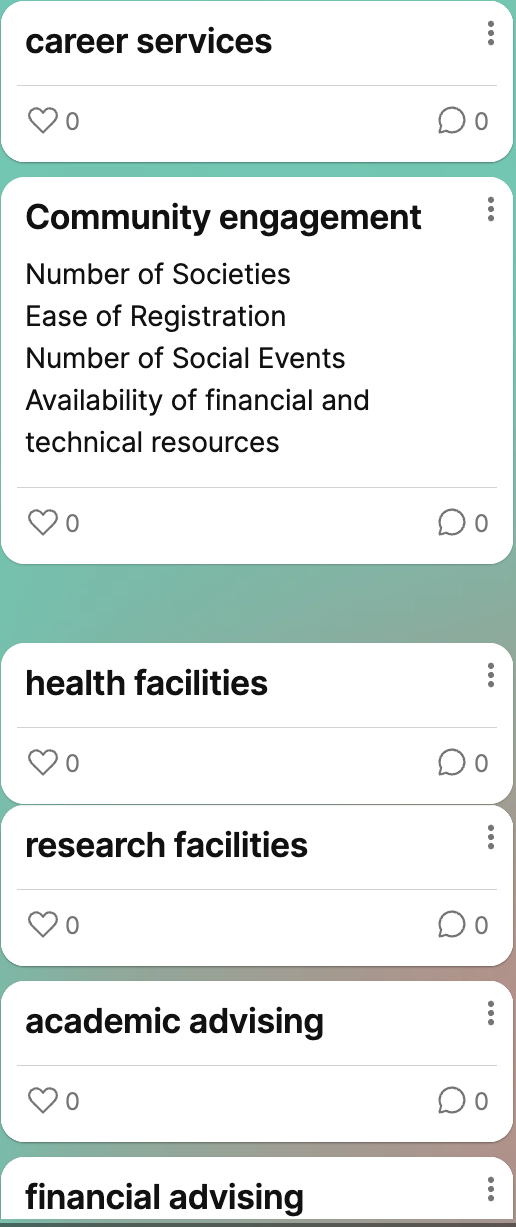
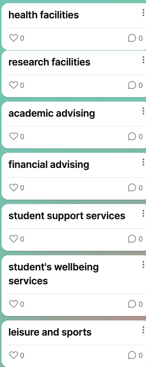
Working through this workshop really opened my eyes about the complexities of data collection and classification. One thing I learnt was the importance of clearly defining the scope of our research. For instance, when collecting data on the student experience, we listed out all of the aspects that would fall into the umbrella of “student experience”, from academic resources, employability or career resources, financial resources, to community engagement,... (see IMG 4.1 & 4.2). Now the availability of resources that prompted us to choose this scenario became a problem: how can we narrow down our focus?

IMG 4.1
IMG 4.2

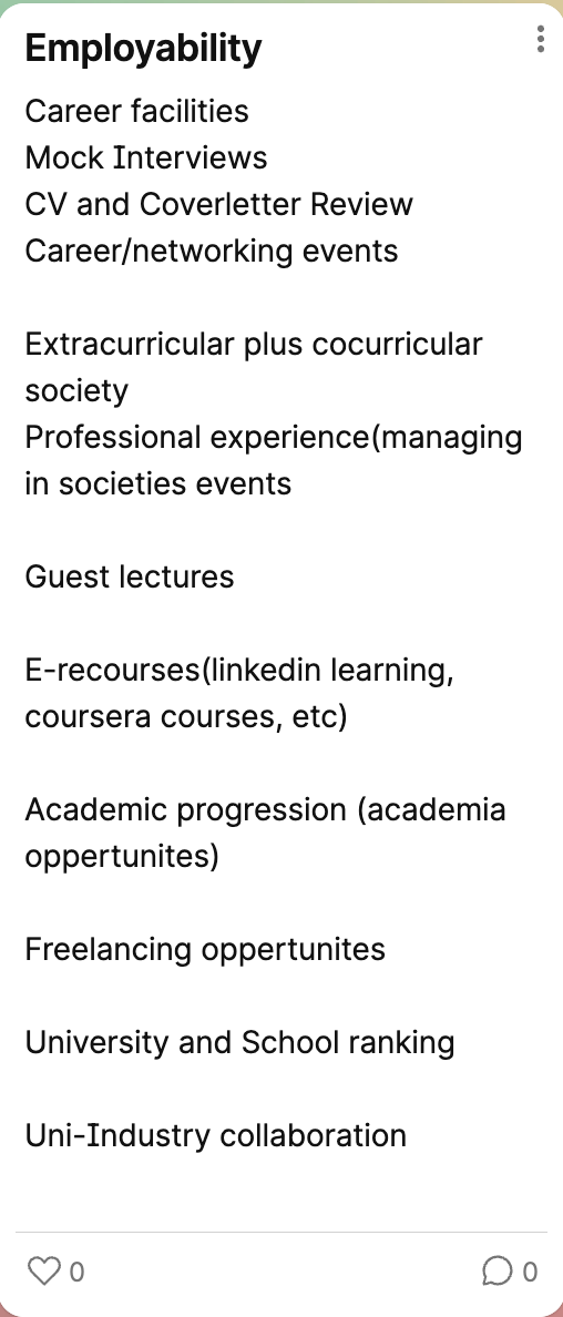
To further refine this focus, we brainstormed and listed various aspects of employability (see IMG 4.3). However, even with this narrowed scope, we realised there were still too many options to analyse. Our attempt felt futile as the breadth of potential subtopics continued to challenge us. I finally understand what Crawford (2021) meant when they wrote: “From the outset, data was characterized as something voluminous, disorganized, impersonal, and ready to be exploited.” (p.107) Employability data, for example, is seemingly straightforward, yet it quickly becomes overwhelming to us due to its volume and the interconnectedness of its elements. It is easy to overlook the complex labour and critical thinking required to process and interpret data meaningfully. Our struggle to make sense of employability data proved the tension between the messy, multifaceted reality of human experiences and the oversimplified way they are often represented in data visualisation systems.

IMG 4.3

Then, Holly visited our table and, after listening to our explanation, suggested that we focus on collecting employability information from the program prospectus, including employability rate, availability of career fairs and workshops, etc. She recommended including five programs from the School of Communication and Media. This guidance gave us a clearer understanding of the specific type of data we should prioritise.

This experience has made me reflect deeply on how data, specifically, the data generated from our everyday activities, is gathered and labelled. While supercomputers can now generate massive amounts of data in less than a second, the task of labelling still heavily relies on human labour. As Crawford (2021) highlighted, the practice of labelling large datasets is often outsourced to crowdworkers who are severely underpaid for what is considered manual labour. But is labelling data really as straightforward as it seems? Based on our experience of constantly brainstorming, listing, focusing, refocusing, and narrowing down in the workshop, I find it hard to believe that labelling data is a simple task. The nature of human experience itself is inherently multifaceted and deeply context-dependent. Who gets to decide which label is appropriate for a given piece of data, and what criteria guide these decisions?

Reference:

Crawford, K. 2021. Data. In: The atlas of AI : power, politics, and the planetary costs of artificial intelligence. New Haven: Yale University Press, pp. 89-122

October 24, 2024

Week 3: Web Scraping

This week, I explored web scraping using the free web scraper plugin on my browser, and the experience was somewhat frustrating. While I expected the process to be smooth, there were several obstacles that made it inconvenient.

One of the major inconveniences I encountered was the plugin's lack of efficiency when selecting multiple items on certain sections of websites. For example, when scraping data from menu content or reflection sections, the plugin often failed to recognize multiple elements at once. Instead of selecting the entire list of items in one go, I had to manually click and select each item, which was time-consuming and tedious. At some items, the selector could not recognize them and thus, prevented me from extracting the data (see IMG 1.1 and 1.2). The tool’s inability to handle multiple selections mean users would have to spend more time. This shows that the tool is not suitable and efficient enough to scrape larger datasets.

Error 1
Error 2

Another challenge was the inconsistency in how the plugin interacted with certain website layouts. Even when I followed the recommended steps for setting up the scraper, the plugin would sometimes ignore specific elements or extract incomplete data. This made it difficult to rely on for more complex projects, especially if I needed structured information.

This week lesson gave me valuable insights into the limitations of free tools. I realized that more advanced scrapers (and more expensive at that) or custom scripts are needed for larger-scale data extraction projects.

October 17, 2024

Week 2: Make website from scratch

Website layout

As a student without a technical background, creating a website from scratch using HTML and CSS was both a challenging and interesting experience. One of the main difficulties I faced was understanding the technical syntax and structure of these coding languages. Although I have previously done some simple projects using HTML and CSS, they still required a steep learning curve for someone without prior coding experience. The specificity of tags, attributes, and rules often led to errors that were hard to diagnose and difficulty in customisation.

Another barrier was the complexity of combining design with functionality. While I had a specific vision for the website's layout and style, translating that into functional code was not straightforward, even when using available templates. The concepts of responsive design, positioning elements, and ensuring compatibility led to additional challenges. However, I was able to simplify some of the codes and therefore, making my website easier to manage.

Website code

Despite these barriers, the experience taught me valuable lessons in problem-solving, patience, and the importance of attention to detail. I truly admire website technicians and appreciate the technical skills required to build even the simplest of websites.

Let's get in Touch

Contact

University of Leeds, Leeds, West Yorkshire, United Kingdom